A beverage can, built once and shot every way
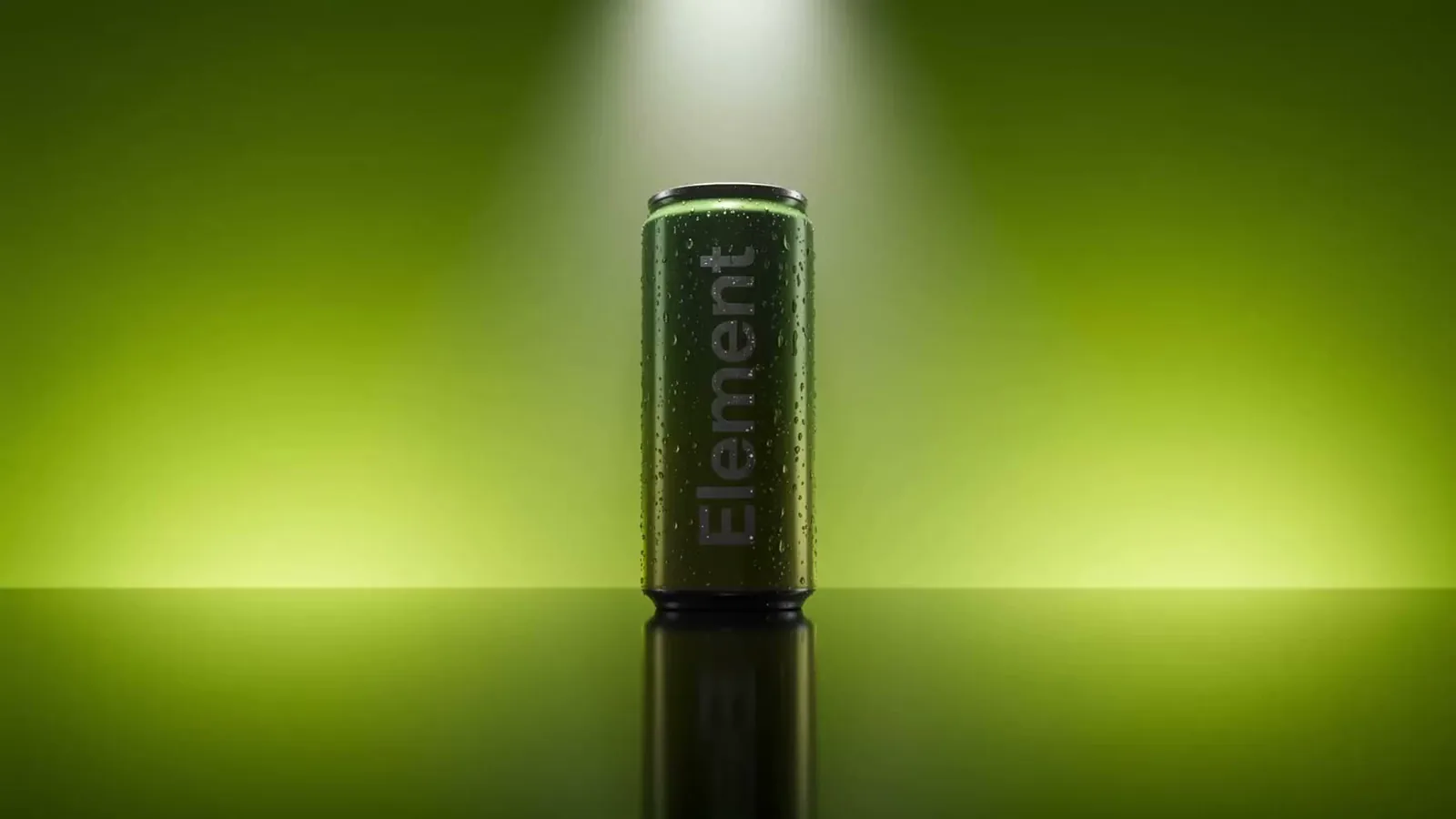
A drinks can looks like the easiest possible product to render and is one of the least forgiving. It is a mirror wrapped in a curve, covered in artwork that cannot distort, and usually wet. This one was built as a single digital product and then shot as a studio packshot, a 360° turntable and a lifestyle scene.
- Discipline
- 3D product rendering and animation
- Built from
- Container dimensions and label artwork
- Outputs
- Studio packshot, 360° turntable, lifestyle scene
- Techniques
- Anisotropic metal, UV label wrap, condensation simulation
The three places a can render fails
Aluminium is not grey plastic with a shine. It is anisotropic — the highlight smears along the direction the metal was drawn, which is why a real can has a soft vertical streak rather than a round hotspot. Get that wrong and the can reads as a plastic bottle no matter how clean the modelling is. Second, the label has to wrap a compound curve without stretching, which is a UV problem rather than a texture problem: type near the silhouette compresses if the unwrap is naive, and type is exactly where the eye checks. Third, condensation. Beads are not a texture. Real ones refract what is behind them, so a bead sitting over the label shows the label inverted through itself, and they sag under their own weight rather than sitting as perfect circles.
How it was built
- Container modelled to real dimensions — a known shape, so no scanning needed
- Label artwork unwrapped onto the curve so type stays true near the silhouette
- Aluminium authored as anisotropic metal with the draw direction following the body
- Condensation scattered as real geometry with refraction, graded by height
- Studio lighting built once, then reused unchanged for every output
Why one build covers a whole range
The expensive part of this was the container and its materials, and none of that changes between flavours. A second SKU is the same model with different artwork mapped onto the same unwrap, lit by the same rig — which means it costs a small fraction of the first and is guaranteed to match it, rather than being matched by a colourist afterwards. For a category that ships a new flavour, a limited edition and a festive pack in the same year, that is the entire argument for rendering over shooting.
What came off it
A white-background packshot sized for retailer and marketplace listings, a 360° turntable for a product detail page, and a lifestyle build with ice, citrus and splash simulation for campaign use. Same can in all three. Nothing was re-shot, re-lit or re-matched between them, because there was nothing to re-shoot — only new cameras pointed at an asset that already existed.